Create/Edit Post
Overview
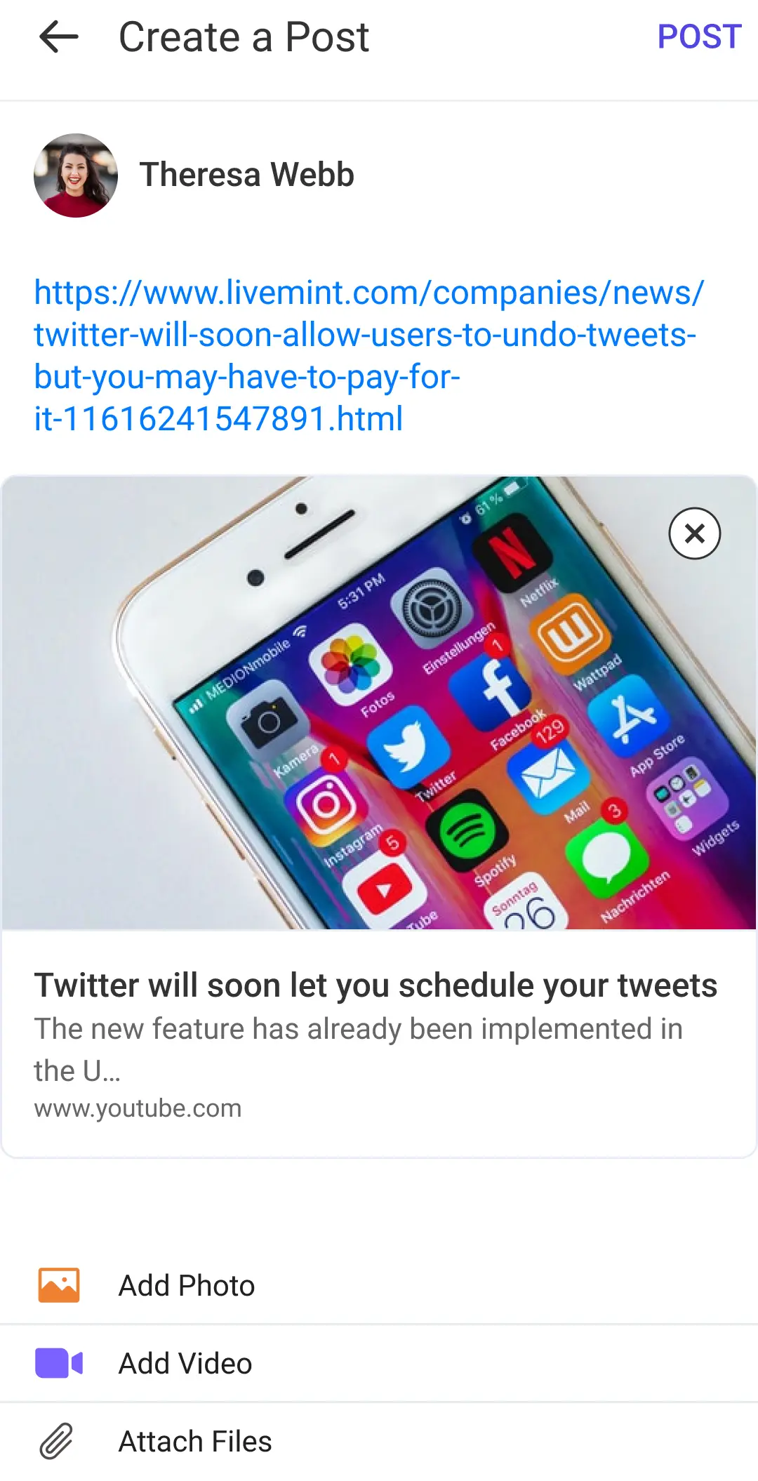
The CreatePost screen allows users to create posts by adding text, images, videos, and documents. It provides various UI components and functionalities to facilitate the post creation process.
GitHub Files:
UI Components
- LMCreatePostHeader
- LMCreatePostUIRender
- LMUserProfileSection
- LMCreatePostTopics
- LMCreatePostHeading
- LMCreatePostTextInput
- LMCreatePostUserTagging
- LMCreatePostMedia
- LMCreatePostAttachmentSelection
- LMCreatePostAnonymousCheckbox
Props
These props allow for customization and interaction handling in the CreatePost screen:
Interaction Callbacks
| Prop Name | Type | Description |
|---|---|---|
handleGalleryProp | Function | Triggered when the gallery is accessed. Receives the type of gallery as a string. |
handleDocumentProp | Function | Triggered when a document is accessed. |
handlePollProp | Function | Triggered when a poll is accessed. |
onPostClickProp | Function | Triggered when a post is clicked. Provides post media, links, content, heading, topics, poll, and optionally isAnonymous. |
handleScreenBackPressProp | Function | Triggered when the back button is pressed. |
handleOnAnonymousPostClickedProp | Function | Triggered when an anonymous post checkbox is clicked. Receives isAnonymous boolean. |
Feature Configuration
| Prop Name | Type | Description | Required |
|---|---|---|---|
isHeadingEnabled | boolean | Enables or disables the heading. | ✅ |
hideTopicsViewCreate | boolean | Hides the topics view on the create post screen. | |
hideTopicsViewEdit | boolean | Hides the topics view on the edit post screen. | |
isAnonymousPostAllowed | boolean | Allows creation of anonymous posts if true. | |
hintTextForAnonymous | string | Hint text specifically for anonymous posts. |
For more callback info, see the callback context source.
Styling Customizations
| Property | Type | Description | Required |
|---|---|---|---|
userNameTextStyle | TextStyle | Represents the style of the username text. | |
createPostScreenHeader | CreatePostScreenHeader | Contains properties for the create post screen header. | |
attachmentOptionsStyle | AttachmentOptionsStyle | Contains styles for attachment options. | ✔️ |
createPostTextInputStyle | CreatePostTextInputStyle | Contains styles for the create post text input. | ✔️ |
addMoreAttachmentsButton | AddMoreAttachmentsButton | Contains properties for the add more attachments button. | ✔️ |
CreatePostScreenHeader
| Property | Type | Description |
|---|---|---|
showBackArrow | boolean | Indicates whether to show the back arrow. |
editPostHeading | string | The heading text when editing a post. |
createPostHeading | string | The heading text when creating a new post. |
rightComponent | React.ReactNode | The component to be displayed on the right side. |
subHeading | string | The subheading text to be displayed. |
backIcon | LMIconProps | Represents the back icon properties. |
subHeadingTextStyle | TextStyle | Represents the style of the subheading text. |
headingTextStyle | TextStyle | Represents the style of the heading text. |
headingViewStyle | ViewStyle | Represents the style of the heading view. |
AttachmentOptionsStyle
| Property | Type | Description |
|---|---|---|
attachmentOptionsView | ViewStyle | Style for the attachment options view. |
photoAttachmentView | ViewStyle | Style for the photo attachment view. |
photoAttachmentIcon | LMIconProps | Properties for the photo attachment icon. |
photoAttachmentTextStyle | LMTextProps | Style for the photo attachment text. |
videoAttachmentView | ViewStyle | Style for the video attachment view. |
videoAttachmentIcon | LMIconProps | Properties for the video attachment icon. |
videoAttachmentTextStyle | LMTextProps | Style for the video attachment text. |
filesAttachmentView | ViewStyle | Style for the files attachment view. |
filesAttachmentIcon | LMIconProps | Properties for the files attachment icon. |
filesAttachmentTextStyle | LMTextProps | Style for the files attachment text. |
CreatePostTextInputStyle
| Property | Type | Description |
|---|---|---|
inputTextStyle | TextStyle | Style for the input text. |
placeholderText | string | Text to be displayed when the input is empty. |
placeholderTextColor | string | Color of the placeholder text. |
rightIcon | Object | Properties for the right icon of the input. |
textValueStyle | TextStyle | Style for the text value. |
mentionTextStyle | TextStyle | Style for the mention text. |
multilineField | boolean | Indicates if the input should be multiline. |
AddMoreAttachmentsButton
| Property | Type | Description | Required |
|---|---|---|---|
text | LMTextProps | Properties for the text on the button. | ✔️ |
icon | LMIconProps | Properties for the icon on the button. | ✔️ |
onTap | Function | Function to execute on button tap. | ✔️ |
placement | "start" or "end" | Placement of the icon on the button. | ✔️ |
buttonStyle | ViewStyle | Style for the button. | ✔️ |
isClickable | boolean | Indicates if the button is clickable. | ✔️ |
Usage Example
Step 1: Create the Post Screen Component
- Create a
CreatePostScreenfile which defines the UI components and interactions callbacks for creating a post.
import React from "react";
import {
  CreatePost,
  useCreatePostContext,
} from "@likeminds.community/feed-rn-core";
import {
  LMCreatePostAttachmentSelection,
  LMCreatePostHeader,
  LMCreatePostHeading,
  LMCreatePostMedia,
  LMCreatePostTextInput,
  LMCreatePostTopics,
  LMCreatePostUIRender,
  LMCreatePostUserTagging,
  LMUserProfileSection,
  LMCreatePostAnonymousCheckbox
} from "@likeminds.community/feed-rn-core";
import STYLES from "@likeminds.community/feed-rn-core/constants/Styles";

const CreatePostScreen = () => {
  const {
    handleDocument,
    handleGallery,
    onPostClick,
  } = useCreatePostContext();

  const customHandleDocumentProp = () => {
    console.log("before document handle");
    handleDocument();
    console.log("after document handle");
  };
  const customHandleGalleryProp = (type) => {
    console.log("before gallery handle");
    handleGallery(type);
    console.log("after gallery handle");
  };
  const customHandleCreatePost = (
    allAttachment,
    formattedLinkAttachments,
    postContentText,
    heading,
    topics,
    poll,
    isAnonymous
  ) => {
    console.log("before post click");
    onPostClick(
      allAttachment,
      formattedLinkAttachments,
      postContentText,
      heading,
      topics,
      poll,
      isAnonymous
    );
    console.log("after post click");
  };

  const createPostStyles = {
    userNameTextStyle: {
      color: "green",
    },
    createPostScreenHeader: {
      subHeading: "LikeMinds",
    },
  };

  // hide create poll button to disable poll creation
  const pollStyles = {
    hidePoll: true
  }

  if (pollStyles) {
    STYLES.setPollStyle(pollStyles)
  }

  // customisation with styles
  if (createPostStyles) {
    // create post screen customisation
    STYLES.setCreatePostStyles(createPostStyles);
  }

  return (
    <CreatePost
      // callbacks
      handleDocumentProp={() => customHandleDocumentProp()}
      handleGalleryProp={(type) => customHandleGalleryProp(type)}
      onPostClickProp={(
        allAttachment,
        formattedLinkAttachments,
        postContentText,
        heading,
        topics,
        poll,
        isAnonymous
      ) =>
        customHandleCreatePost(
          allAttachment,
          formattedLinkAttachments,
          postContentText,
          heading,
          topics,
          poll,
          isAnonymous
        )
      }
      // customisation with props
      isHeadingEnabled={true}
      isAnonymousPostAllowed
    >
      {/* screen header section*/}
      <LMCreatePostHeader />

      {/* handles the UI to be rendered for edit post and create post */}
      <LMCreatePostUIRender>
        {/* user profile section */}
        <LMUserProfileSection />

        {/* Anonymous post checkbox */}
        <LMCreatePostAnonymousCheckbox/>

        {/* post topics section */}
        <LMCreatePostTopics />

        {/* post heading section */}
        <LMCreatePostHeading />

        {/* text input field */}
        <LMCreatePostTextInput />

        {/* users tagging list */}
        <LMCreatePostUserTagging />

        {/* selected media section */}
        <LMCreatePostMedia />

        {/* selection options section */}
        <LMCreatePostAttachmentSelection />
      </LMCreatePostUIRender>

    </CreatePost>
  );
};

export default CreatePostScreen;
Step 2: Wrap the Screen with Context Providers
- Create a
CreatePostScreenWrapperthat wraps the screen with bothCreatePostContextProviderandUniversalFeedContextProvider.
import {
  CreatePostContextProvider,
  UniversalFeedContextProvider,
} from "@likeminds.community/feed-rn-core";
import CreatePostScreen from "<<path_to_CreatePostScreen.tsx>>";

const CreatePostScreenWrapper = ({ navigation, route }) => {
  return (
    <UniversalFeedContextProvider navigation={navigation} route={route}>
      <CreatePostContextProvider navigation={navigation} route={route}>
        <CreatePostScreen />
      </CreatePostContextProvider>
    </UniversalFeedContextProvider>
  );
};

export default CreatePostScreenWrapper;
Step 3: Add the Custom Screen in App.tsx
- In your
App.tsx, create aStack.Navigatorin theNavigationContainerwrapped byLMOverlayProvider. - Add
CreatePostScreenWrapperas a Stack screen in yourNavigationContainer.
import {
  CREATE_POST,
  LMOverlayProvider,
  STYLES,
} from "@likeminds.community/feed-rn-core";
import { CreatePostScreenWrapper } from "<<path_to_CreatePostScreenWrapper.tsx>>";
import { NavigationContainer } from "@react-navigation/native";
import { createNativeStackNavigator } from "@react-navigation/native-stack";

export const App = () => {
  const Stack = createNativeStackNavigator();
  return (
    <LMOverlayProvider
      myClient={myClient} // pass in the LMFeedClient created
      apiKey={apiKey} // pass in the API Key generated
      userName={userName} // pass in the logged-in user's name
      userUniqueId={userUniqueID} // pass in the logged-in user's uuid
    >
      <NavigationContainer ref={navigationRef} independent={true}>
        <Stack.Navigator screenOptions={{ headerShown: false }}>
          <Stack.Screen
            name={CREATE_POST}
            component={CreatePostScreenWrapper}
          />
        </Stack.Navigator>
      </NavigationContainer>
    </LMOverlayProvider>
  );
};