Search Screen
Overview
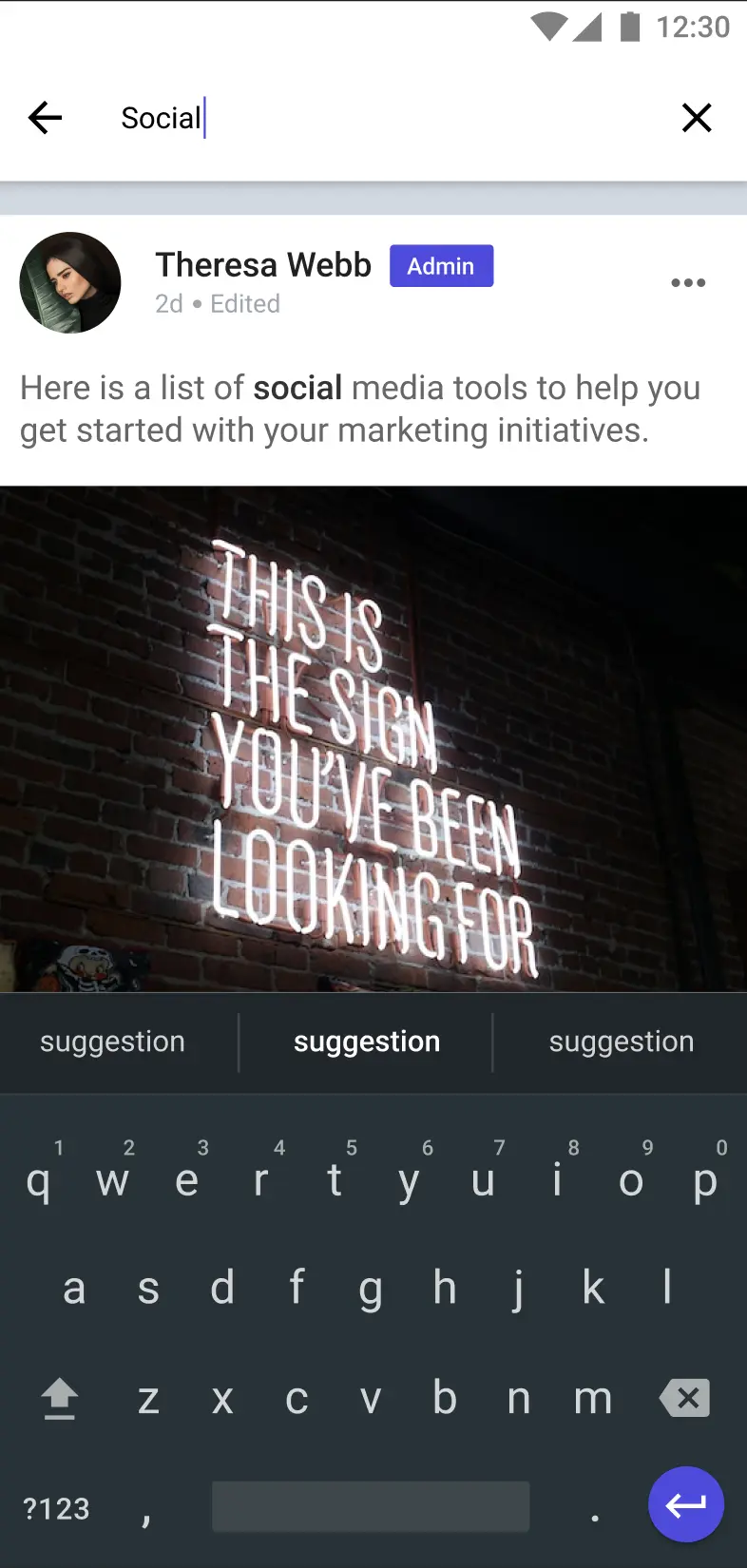
SearchFeed displays a feed screen with an input box and a list of posts that are fetched based on the given search query.
GitHub Files:
Props
These props can be used to customize the behavior and interactivity of the SearchFeed screen:
Interaction Callbacks
| Prop Name | Type | Description |
|---|---|---|
postLikeHandlerProp | Function | Triggered when a post is liked. Receives the post id. |
savePostHandlerProp | Function | Triggered when a post is saved/unsaved. Receives id and optional saved. |
selectPinPostProp | Function | Triggered to pin/unpin a post. Receives id and pinned status. |
selectEditPostProp | Function | Allows editing of a post. Receives id and post data. |
onSelectCommentCountProp | Function | Triggered on comment count tap. Receives the post id. |
onTapLikeCountProps | Function | Triggered when like count is tapped. Receives the post id. |
handleDeletePostProps | Function | Allows deletion of a post. Receives visible and postId. |
handleReportPostProps | Function | Handles reporting of a post. Receives the post id. |
newPostButtonClickProps | Function | Custom action when new post button is clicked. |
onOverlayMenuClickProp | Function | Custom action for overlay menu. Receives event, menu items, post id. |
onSharePostClicked | Function | Handles post sharing. Receives the post id. |
onSubmitButtonClicked | Function | Custom action for poll submission. |
onAddPollOptionsClicked | Function | Custom action for adding poll options. |
onPollOptionClicked | Function | Custom action when a poll option is clicked. |
onBackArrowPressProp | Function | Custom action when back arrow is pressed. |
onCrossPressProp | Function | Custom action when the input clear icon is pressed. |
Feature Configuration
| Prop Name | Type | Description |
|---|---|---|
isHeadingEnabled | boolean | Enables or disables the heading display. |
isTopResponse | boolean | Displays top responses if true. |
hideTopicsView | boolean | Hides the topics view if true. |
lmPostCustomFooter | JSX | A custom component to use as the footer for post items. |
customWidgetPostView | JSX | A custom component to override the default post item layout. |
For the complete source code, refer to the GitHub link
Styling Customizations
These styles allow you to customize the visual appearance of the SearchFeed screen through the STYLES Class:
| Style Prop | Type | Description |
|---|---|---|
placeholderText | string | Text shown when input is empty. |
placeholderTextColor | string | Color for the placeholder text. |
searchQueryTextStyle | TextStyle | Style for the entered search query text. |
inputBoxStyle | ViewStyle | Style for the container of the input box. |
crossIconStyle | LMIconProps | Style for the clear (cross) icon. |
backIconStyle | LMIconProps | Style for the back navigation icon. |
listEmptyStyle | object | Container style when the result list is empty. |
├ listEmptyTextStyle | TextStyle | Style for the empty list text. |
└ listEmptyImageStyle | LMIconProps | Style for the empty list image/icon. |
For the complete source code, refer to the GitHub link
Usage Example
Step 1: Create the Custom Search Feed Screen
- Create a
CustomSearchFeedfile that uses theSearchFeedcomponent and its hooks to apply your callback and style customizations.
import {
  SearchFeed,
  SearchedPostListContextProvider,
  useSearchedPostListContext,
} from "@likeminds.community/feed-rn-core";
import STYLES from "@likeminds.community/feed-rn-core/constants/Styles";

const CustomSearchFeed = ({ navigation, route }) => {

  // example of callback customizations
  const {
    postLikeHandler,
    savePostHandler,
  } = useSearchedPostListContext();

  const customPostLike = (postId) => {
    console.log("before like ");
    postLikeHandler(postId);
    console.log("after like", postId);
  };
  const customPostSave = (postId, saved) => {
    console.log("before save");
    savePostHandler(postId, saved);
    console.log("after save", postId, saved);
  };

  // example of styling customizations
  const searchFeedStyles = {
    crossIconStyle: {
      height: 20,
      width: 20,
      color: "blue",
      assetPath: require("./gallery_icon3x.png"),
    },
    backIconStyle: {
      color: "red",
      assetPath: require("./gallery_icon3x.png"),
    },
    placeholderText: "PLACEHOLDER...",
    placeholderTextColor: "grey",
    searchQueryTextStyle: {
      color: "red",
    },
  };

  STYLES.setSearchFeedStyles(searchFeedStyles);

  return (
    <SearchFeed
      postLikeHandlerProp={(id) => customPostLike(id)}
      savePostHandlerProp={(id, saved) => customPostSave(id, saved)}
      isHeadingEnabled={true}
      isTopResponse={true}
      navigation={navigation}
      route={route}
    />
  );
};

export default CustomSearchFeed;
Step 2: Wrap the Screen with Context Provider
- Create a
SearchFeedScreenWrapperfile and wrap your custom screen with the required context provider.
import CustomSearchFeed from "<<path_to_CustomSearchFeed.tsx>>";
import {
  PostListContextProvider,
  UniversalFeedContextProvider,
  SearchType
} from "@likeminds.community/feed-rn-core";

const SearchFeedScreenWrapper = ({ navigation, route }) => {
  return (
    <SearchedPostListContextProvider
      searchType={<"SEARCH_TYPE">} // Pass a value present in the SearchType Enum
      navigation={navigation}
      route={route}
    >
        <CustomSearchFeed navigation={navigation} route={route} />
    </UniversalFeedContextProvider>
  );
};

export default SearchFeedScreenWrapper;
Step 3: Add the Custom Screen in App.tsx
- In your
App.tsx, create aStack.Navigatorin theNavigationContainerwrapped byLMOverlayProvider. - Add
SearchFeedScreenWrapperas a Stack screen in yourNavigationContainer.
import {
  SEARCH_SCREEN,
  LMOverlayProvider,
} from "@likeminds.community/feed-rn-core";
import { NavigationContainer } from "@react-navigation/native";
import { createNativeStackNavigator } from "@react-navigation/native-stack";
import SearchFeedScreenWrapper from "<<path_to_SearchFeedScreenWrapper.tsx>>";

export const App = () => {
  const Stack = createNativeStackNavigator();
  return (
    <LMOverlayProvider
      myClient={myClient} // pass in the LMFeedClient created
      apiKey={apiKey} // pass in the API Key generated
      userName={userName} // pass in the logged-in user's name
      userUniqueId={userUniqueID} // pass in the logged-in user's uuid
    >
      <NavigationContainer ref={navigationRef} independent={true}>
        <Stack.Navigator screenOptions={{ headerShown: true }}>
          <Stack.Screen
            name={SEARCH_SCREEN}
            component={SearchFeedScreenWrapper}
          />
        </Stack.Navigator>
      </NavigationContainer>
    </LMOverlayProvider>
  );
};