Carousel screen
Overview
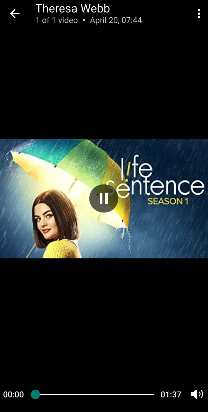
The CarouselScreen component is designed to display a carousel of images or media within a screen format, allowing users to swipe through a set of media items. It supports various media types like images and videos and includes pagination controls for easy navigation. The component is customizable, enabling developers to style and configure media elements to fit the overall UI. Commonly used in posts or feeds, it provides an interactive and visually engaging way for users to view multiple media items.
GitHub File:
- ImageCarouselScreen
- VideoCarouselScreen

UI Components
Props
onBackPressOnCarouselScreen: Its trigerred on pressing of the back button in carousel screen.
Styling Customizations
The STYLES class allows you to customize the appearance of the LMPostContent. You can set the styles in carouselScreenStyle in STYLES.
Usage Example
- In your
App.tsx, create aStack.Navigatorin theNavigationContainerwrapped byLMOverlayProvider. - Add
CarouselScreenas a Stack screen in yourNavigationContainer. - Create
carouselScreenStylefor customisation and call thesetCarouselScreenStylesto set the customisation. - Create a
CustomCallbacksimplementingLMCarouselScreenCallbacks, and override theonBackPressOnCarouselScreenwith custom logic.
App.tsx
import {
  CAROUSEL_SCREEN,
  CarouselScreen,
  LMOverlayProvider,
  STYLES,
  LMCarouselScreenCallbacks,
} from "@likeminds.community/feed-rn-core";
import { NavigationContainer } from "@react-navigation/native";
import { createNativeStackNavigator } from "@react-navigation/native-stack";

// custom callback class implementing carouselCallBackClass
class CustomCallbacks implements LMCarouselScreenCallbacks {
  onBackPressOnCarouselScreen() {
    // override onBackPressOnCarouselScreen with custom logic
    navigationRef.goBack();
  }
}

const lmFeedInterface = new CustomCallbacks();

export const App = () => {
  const Stack = createNativeStackNavigator();
  const carouselScreenStyle = {
    headerTitle: {
      color: "green",
    },
    headerSubtitle: {
      color: "purple",
    },
    thumbTintColor: "pink",
    minimumTrackTintColor: "red",
    maximumTrackTintColor: "blue",
    muteIconPath: "https://lm.jpg",
    isMuteIconLocalPath: false,
    muteIconStyle: {
      tintColor: null,
    },
    unmuteIconStyle: {
      tintColor: "red",
    },
  };

  // carousel screen customisation
  if (carouselScreenStyle) {
    STYLES.setCarouselScreenStyles(carouselScreenStyle);
  }

  return (
    <LMOverlayProvider
      myClient={myClient} // pass in the LMFeedClient created
      apiKey={apiKey} // pass in the API Key generated
      userName={userName} // pass in the logged-in user's name
      userUniqueId={userUniqueID} // pass in the logged-in user's uuid
      lmFeedInterface={lmFeedInterface} // pass the callback interface object
    >
      <NavigationContainer ref={navigationRef} independent={true}>
        <Stack.Navigator screenOptions={{ headerShown: false }}>
          <Stack.Screen
            options={{ gestureEnabled: false }}
            name={CAROUSEL_SCREEN}
            component={CarouselScreen}
          />
        </Stack.Navigator>
      </NavigationContainer>
    </LMOverlayProvider>
  );
};