Send DM Request Modal
Overview
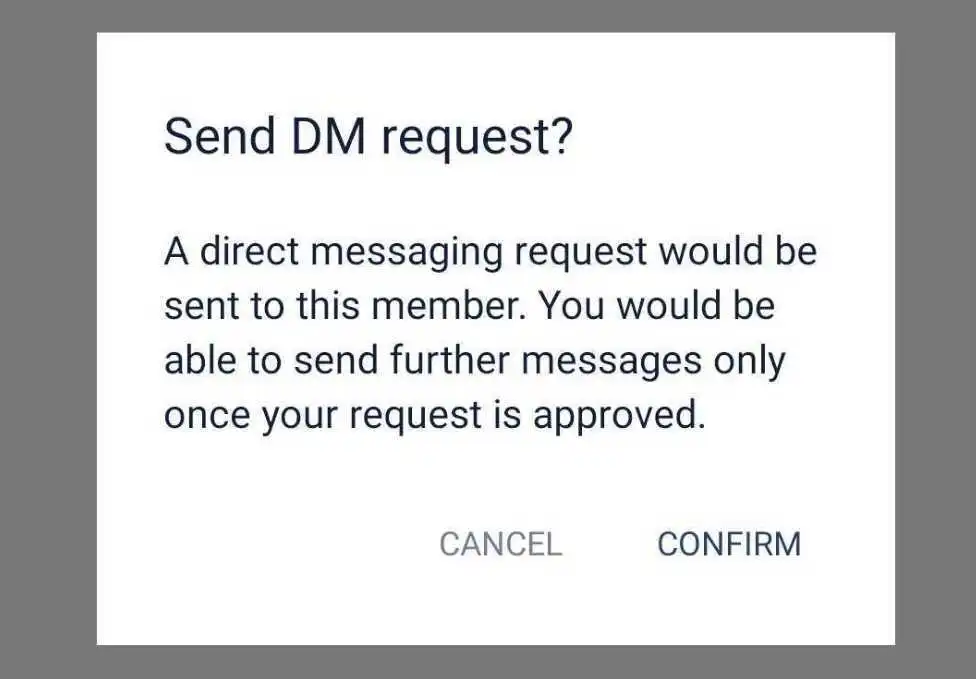
The SendDMRequestModal component provides a user interface to confirm sending a Direct Message (DM) request. It is designed to display a confirmation dialog with customizable actions and messages.
GitHub File:
Copy
Theming Customizations
The SendDMRequestModal component now supports additional theming through inputBoxStyles.sendDMRequestModalStyles. Below are the properties that have been added:
Properties
| Property Name | Type | Description |
|---|---|---|
containerStyle | ViewStyle | Custom styling for the modal container. |
messageTextStyle | TextStyle | Custom styling for the message text inside the modal. |
buttonContainerStyle | ViewStyle | Custom styling for the button container. |
sendButtonStyle | ViewStyle | Custom styling for the send button. |
cancelButtonStyle | ViewStyle | Custom styling for the cancel button. |
Props
| Property | Type | Description | Optional |
|---|---|---|---|
hideDMSentAlert | Function | Function to close the modal. | |
DMSentAlertModalVisible | boolean | Controls the visibility of the modal. | |
onSend | Function | Function to execute when the confirm button is pressed. | |
message | string | The message content to be sent with the DM request. | ✔️ |
Features
Confirmation Dialog:
- Displays a message to confirm the action of sending a DM request.
- Provides cancel and confirm buttons for user interaction.
Customizable Behavior:
- Allows passing a custom
onSendfunction to handle the DM request logic. - Accepts a custom message to be sent with the request.
- Allows passing a custom
User-Friendly Design:
- Includes descriptive text and buttons for clear navigation.
- Automatically hides the modal upon confirmation or cancellation.
Transparent Background:
- The modal has a transparent backdrop to maintain focus on the dialog.
Usage Example
Applying Callbacks & Styling to MessageInputBox
import React from "react";
import { View } from "react-native";
import {
  AddFilesView,
  AddMoreFilesView,
  EditBox,
  InputBoxView,
  InputWrapper,
  InputWrapperLeftSection,
  LinkPreviewInputView,
  ReplyBoxView,
  SelectFilesModal,
  SendDMRequestModal,
  TextInputWrapper,
  useInputBoxContext,
  VoiceNoteRecordToast,
  UserTaggingList,
  RecordSendInputFabView,
} from "@likeminds.community/chat-rn-core";

const MessageInputBox = () => {
  const { hideDMSentAlert, message, DMSentAlertModalVisible, onSend } =
    useInputBoxContext();


  // Define custom styles for SendDMRequestModal
  const sendDMRequestModalStyles = {
    containerStyle: {
      backgroundColor: "white",
      padding: 20,
      borderRadius: 15,
    },
    messageTextStyle: {
      fontSize: 16,
      color: "#333",
    },
    buttonContainerStyle: {
      flexDirection: "row",
      justifyContent: "space-between",
      marginTop: 10,
    },
    sendButtonStyle: {
      backgroundColor: "green",
      padding: 10,
      borderRadius: 5,
    },
    cancelButtonStyle: {
      backgroundColor: "red",
      padding: 10,
      borderRadius: 5,
    },
  };

  // Apply the custom styles dynamically
  STYLES.setSendDMRequestModalStyles(sendDMRequestModalStyles);
  return (
    <View>
      <VoiceNoteRecordToast />

      <InputWrapper>
        <InputWrapperLeftSection>
          <UserTaggingList />
          <ReplyBoxView />
          <LinkPreviewInputView />
          <EditBox />

          <TextInputWrapper>
            <AddMoreFilesView />
            <InputBoxView />
            <AddFilesView />
          </TextInputWrapper>
        </InputWrapperLeftSection>

        <RecordSendInputFabView />
      </InputWrapper>

      <SelectFilesModal />
      {/* SendDMRequestModal with dynamic styles from STYLES and custom callbacks*/}
      <SendDMRequestModal
        hideDMSentAlert={hideDMSentAlert}
        DMSentAlertModalVisible={DMSentAlertModalVisible}
        onSend={onSend}
        message={message}
      />
    </View>
  );
};

export default MessageInputBox;
- Use the
MessageInputBoxcomponent as a child of theMessageInputcomponent in the relevant screens: