Select Files Modal
Overview
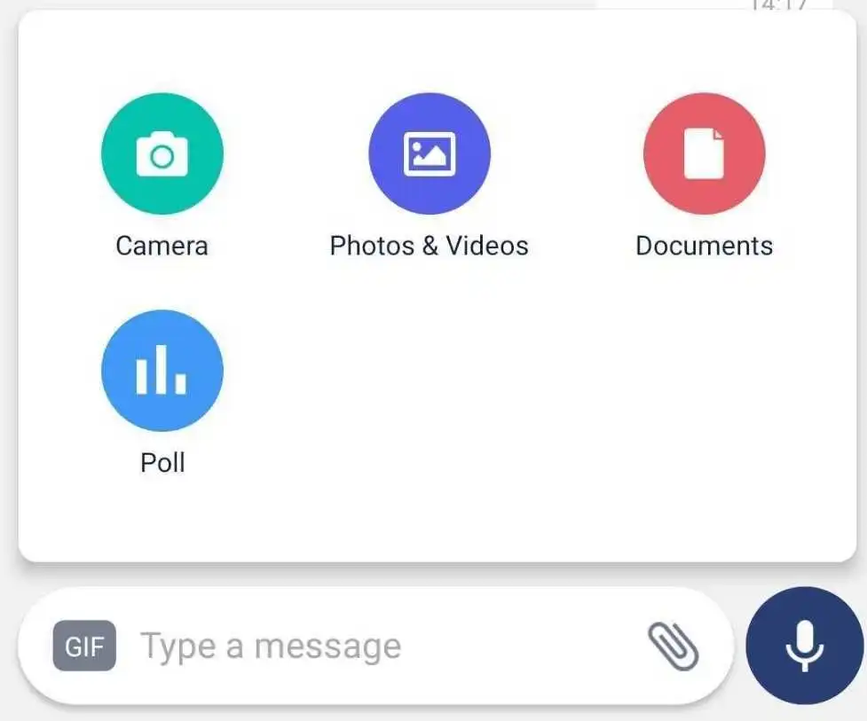
The SelectFilesModal component provides a modal interface for selecting various file types such as images, documents, and polls. It integrates seamlessly with chatroom functionality and is designed for enhanced user interaction with customizable behavior for handling each file type.
GitHub File:
Theming Customizations
The SelectFilesModal component now supports additional theming through inputBoxStyles.selectFilesModalStyles. Below are the properties that have been added:
Properties
| Property Name | Type | Description |
|---|---|---|
centeredView | ViewStyle | Custom styling for the modal's background overlay. |
modalViewParent | ViewStyle | Custom styling for the main modal container. |
modalView | ViewStyle | Custom styling for the inner modal view. |
alignModalElements | ViewStyle | Custom styling for modal elements alignment. |
iconContainer | ViewStyle | Custom styling for the icon container. |
cameraIconStyles | ImageStyle | Custom styling for the camera icon, including tint color and size. |
galleryIconStyles | ImageStyle | Custom styling for the gallery icon, including tint color and size. |
documentIconStyles | ImageStyle | Custom styling for the document icon, including tint color and size. |
pollIconStyles | ImageStyle | Custom styling for the poll icon, including tint color and size. |
Props
| Property | Type | Description | Optional |
|---|---|---|---|
handleGalleryProp | Function | Custom handler for selecting images or videos from the gallery. | ✔️ |
handleDocumentProp | Function | Custom handler for selecting documents. | ✔️ |
handleCameraProp | Function | Custom handler for capturing photos or videos using the camera. | ✔️ |
handlePollProp | Function | Custom handler for navigating to the poll creation screen. | ✔️ |
handleModalCloseProp | Function | Custom handler for closing the modal. | ✔️ |
Features
File Selection Options:
- Camera: Capture photos or videos directly.
- Gallery: Select images or videos from the device's gallery.
- Documents: Upload documents (if the chatroom type allows).
- Polls: Navigate to the poll creation screen (if permitted by the chatroom).
Dynamic Behavior:
- Adapts to the type of chatroom (e.g., DM, Open, Announcement).
- Hides options based on chatroom type and user permissions.
Customizable Handlers:
- Allows overriding default behavior for each file selection type.
User-Friendly Design:
- Includes icons and text for clear identification of options.
- Automatically closes the modal after a selection.
Context Integration:
- Leverages the
InputBoxContextfor managing state and behavior.
- Leverages the
Usage Example
Applying Callbacks & Styling to MessageInputBox
Define custom callbacks and apply custom styles using STYLES.setSelectFilesModalStyles directly within MessageInputBox.
import React from "react";
import { View } from "react-native";
import {
  AddFilesView,
  AddMoreFilesView,
  EditBox,
  InputBoxView,
  InputWrapper,
  InputWrapperLeftSection,
  LinkPreviewInputView,
  ReplyBoxView,
  SelectFilesModal,
  SendDMRequestModal,
  TextInputWrapper,
  useInputBoxContext,
  VoiceNoteRecordToast,
  UserTaggingList,
  RecordSendInputFabView,
} from "@likeminds.community/chat-rn-core";

const MessageInputBox = () => {
  const { hideDMSentAlert, message, DMSentAlertModalVisible, onSend } =
    useInputBoxContext();

  const handleGallery = () => {
    console.log("Gallery option selected.");
  };

  const handleDocument = () => {
    console.log("Document option selected.");
  };

  const handleCamera = () => {
    console.log("Camera option selected.");
  };

  const handlePoll = () => {
    console.log("Poll option selected.");
  };

// Define custom styles for SelectFilesModal
  const selectFilesModalStyles = {
    centeredView: {
      flex: 1,
      justifyContent: "center",
      alignItems: "center",
      backgroundColor: "rgba(0, 0, 0, 0.5)",
    },
    modalViewParent: {
      width: "80%",
      backgroundColor: "white",
      borderRadius: 10,
      padding: 20,
      alignItems: "center",
    },
    cameraIconStyles: {
      assetPath: require("Path to Your Image"),
      height: 30,
      width: 30,
      tintColor: "#4CAF50",
    },
    galleryIconStyles: {
      assetPath: require("Path to Your Image"),
      height: 30,
      width: 30,
      tintColor: "#FF5722",
    },
    documentIconStyles: {
      assetPath: require("Path to Your Image"),
      height: 30,
      width: 30,
      tintColor: "#2196F3",
    },
    pollIconStyles: {
      assetPath: require("Path to Your Image"),
      height: 30,
      width: 30,
      tintColor: "#9C27B0",
    },
  };

  // Apply the styles dynamically
  STYLES.setSelectFilesModalStyles(selectFilesModalStyles);

  return (
    <View>
      <VoiceNoteRecordToast />

      <InputWrapper>
        <InputWrapperLeftSection>
          <UserTaggingList />
          <ReplyBoxView />
          <LinkPreviewInputView />
          <EditBox />

          <TextInputWrapper>
            <AddMoreFilesView />
            <InputBoxView />
            <AddFilesView />
          </TextInputWrapper>
        </InputWrapperLeftSection>

        <RecordSendInputFabView />
      </InputWrapper>

      {/* SelectFilesModal with dynamic styles from STYLES and custom callbacks*/}
      <SelectFilesModal
        handleGalleryProp={handleGallery}
        handleDocumentProp={handleDocument}
        handleCameraProp={handleCamera}
        handlePollProp={handlePoll}
      />
      <SendDMRequestModal
        hideDMSentAlert={hideDMSentAlert}
        DMSentAlertModalVisible={DMSentAlertModalVisible}
        onSend={onSend}
        message={message}
      />
    </View>
  );
};

export default MessageInputBox;
- Use the
MessageInputBoxcomponent as a child of theMessageInputcomponent in the relevant screens: