Reply Box View
Overview
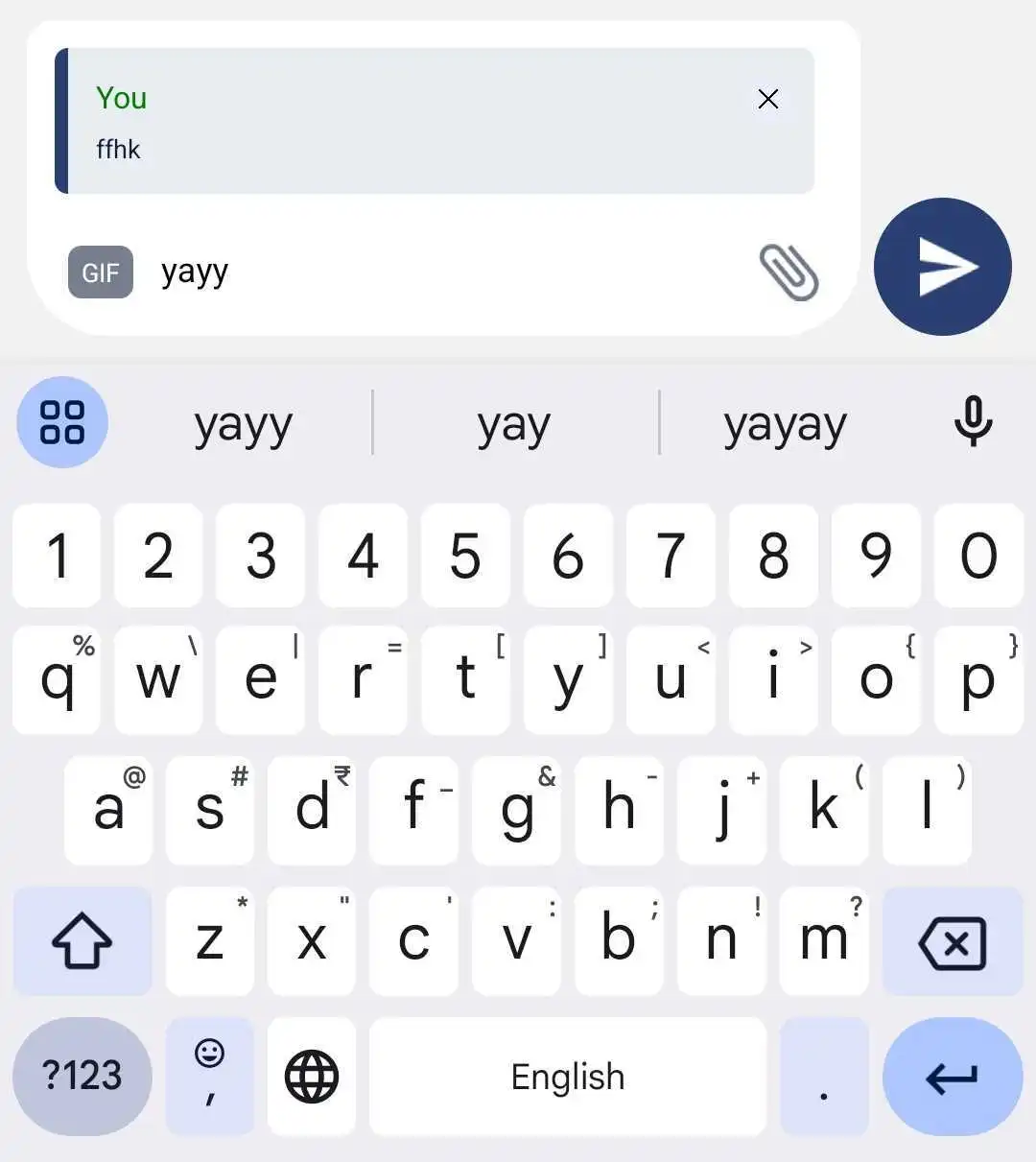
The ReplyBoxView component displays a reply interface for responding to specific messages in a chatroom. It allows users to view the message they are replying to and includes a close button to dismiss the reply box. The component integrates seamlessly with state management and provides customization options.
GitHub File:
UI Components
The ReplyBoxView includes the following elements:
- Reply Box: Displays the message being replied to, utilizing the
ReplyBoxcomponent. - Close Button: A clickable button to dismiss the reply box, with customizable behavior.
Theming Customizations
The ReplyBoxView component now supports additional theming through inputBoxStyles.replyBoxViewStyles. Below are the properties that have been added:
Properties
| Property Name | Type | Description |
|---|---|---|
containerStyle | ViewStyle | Custom styling for the reply box container. |
replyIconStyle | LMChatIconProps | Customize the icon for the reply button, including asset path, height, width, and style. |
textStyle | TextStyle | Customize the text style inside the reply box. |
Props
| Property | Type | Description | Optional |
|---|---|---|---|
handleReplyBoxCloseProp | Function | Custom callback function triggered when the close button is pressed. If not provided, the default behavior dispatches actions to reset the reply state. | ✔️ |
Features
Dynamic Reply Box:
- Displays the message being replied to, with additional context (e.g., chatroom name).
Customizable Close Action:
- Supports a custom callback for closing the reply box or defaults to resetting the reply state.
Seamless State Management:
- Uses context (
InputBoxContext) and Redux dispatch for managing reply states (isReplyandreplyMessage).
- Uses context (
Usage Example
Applying Callbacks & Styling to MessageInputBox
Define custom callbacks and apply custom styles using STYLES.setReplyBoxViewStyle directly within MessageInputBox.
import React from "react";
import { View } from "react-native";
import {
  AddFilesView,
  AddMoreFilesView,
  EditBox,
  InputBoxView,
  InputWrapper,
  InputWrapperLeftSection,
  LinkPreviewInputView,
  ReplyBoxView,
  SelectFilesModal,
  SendDMRequestModal,
  TextInputWrapper,
  useInputBoxContext,
  VoiceNoteRecordToast,
  UserTaggingList,
  RecordSendInputFabView,
} from "@likeminds.community/chat-rn-core";

const MessageInputBox = () => {
  const { hideDMSentAlert, message, DMSentAlertModalVisible, onSend } =
    useInputBoxContext();

  // Customize the reply box close behavior, else simply avoid passing it as a prop to the ReplyBoxView component
  const handleReplyBoxClose = () => {
    console.log("Reply box closed");
  };

 // Define custom styles for the ReplyBoxView
  const replyBoxStyles = {
    containerStyle: {
      backgroundColor: "white",
      padding: 10,
      borderRadius: 8,
    },
    replyIconStyle: {
      assetPath: require("Path to Your Image"), // Customize the reply icon with your asset
      height: 24,
      width: 24,
    },
    textStyle: {
      fontSize: 16,
      color: "gray", // Customize the text style inside the reply box
    },
  };

  // Apply the custom styles using the setReplyBoxViewStyle method
  STYLES.setReplyBoxViewStyle(replyBoxStyles);
  return (
    <View>
      <VoiceNoteRecordToast />

      <InputWrapper>
        <InputWrapperLeftSection>
          <UserTaggingList />
          {/* ReplyBoxView with dynamic styles from STYLES and custom callbacks*/}
          <ReplyBoxView handleReplyBoxCloseProp={handleReplyBoxClose} />
          <LinkPreviewInputView />
          <EditBox />

          <TextInputWrapper>
            <AddMoreFilesView />
            <InputBoxView />
            <AddFilesView />
          </TextInputWrapper>
        </InputWrapperLeftSection>

        <RecordSendInputFabView />
      </InputWrapper>

      <SelectFilesModal />
      <SendDMRequestModal
        hideDMSentAlert={hideDMSentAlert}
        DMSentAlertModalVisible={DMSentAlertModalVisible}
        onSend={onSend}
        message={message}
      />
    </View>
  );
};

export default MessageInputBox;
- Use the
MessageInputBoxcomponent as a child of theMessageInputcomponent in the relevant screens: