Link Preview Input View
Overview
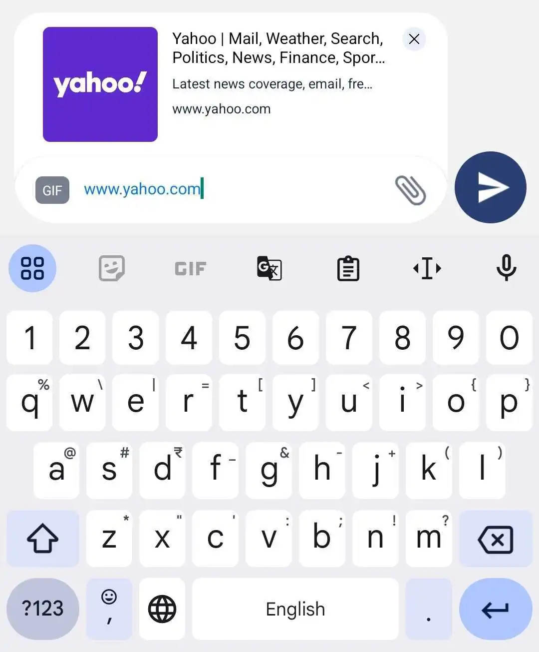
The LinkPreviewInputView component displays a link preview based on Open Graph (OG) tags when a URL is detected in the input box. It provides a close button to dismiss the preview, and the component integrates with the InputBoxContext for managing the preview's visibility and state. This component is typically used in message input areas where users may include links.
GitHub File:
UI Components
The LinkPreviewInputView includes the following elements:
- Link Preview Box: Displays the link preview, which is populated with metadata from the Open Graph tags.
- Close Button: A clickable button to dismiss the link preview, either by executing a custom close callback or using the default behavior defined in the context.
Theming Customizations
The LinkPreviewInputView component now supports additional theming through inputBoxStyles.linkPreviewStyles. The following properties have been added:
| Property Name | Type | Description |
|---|---|---|
| containerStyle | ViewStyle | Custom styling for the link preview container. |
| titleStyle | TextStyle | Custom styling for the link title. |
| descriptionStyle | TextStyle | Custom styling for the link description. |
| imageStyle | ImageStyle | Custom styling for the link preview image. |
| closeIconStyle | LMChatIconProps | Allows customization of the close icon, including assetPath, height, width, and iconStyle. |
Props
| Property | Type | Description | Optional |
|---|---|---|---|
handleLinkPreviewCloseProp | Function | Custom callback function triggered when the close button is pressed. If not provided, the default behavior is used to hide the preview and mark it as closed. | ✔️ |
Features
Dynamic Link Preview:
- Displays the preview of the linked content when OG tags are available and the link preview is enabled in the context state.
Customizable Close Action:
- Supports a custom callback for closing the preview. If not provided, it defaults to hiding the preview and marking it as closed in the context.
State Management Integration:
- Utilizes the
InputBoxContextto manage states such asogTagsState,showLinkPreview, andclosedOnceto determine when to show or hide the preview.
- Utilizes the
Usage Example
Applying Callbacks & Styling to MessageInputBox
Define custom callbacks and apply custom styles using STYLES.setLinkPreviewInputViewStyles directly within MessageInputBox.
import React from "react";
import { View } from "react-native";
import {
  AddFilesView,
  AddMoreFilesView,
  EditBox,
  InputBoxView,
  InputWrapper,
  InputWrapperLeftSection,
  LinkPreviewInputView,
  ReplyBoxView,
  SelectFilesModal,
  SendDMRequestModal,
  TextInputWrapper,
  useInputBoxContext,
  VoiceNoteRecordToast,
  UserTaggingList,
  RecordSendInputFabView,
} from "@likeminds.community/chat-rn-core";

const MessageInputBox = () => {
  const { hideDMSentAlert, message, DMSentAlertModalVisible, onSend } =
    useInputBoxContext();

  // Customize the link preview close behavior, else simply avoid passing it as a prop to the LinkPreviewInputView component
  const handleLinkPreviewClose = () => {
    console.log("Link preview closed");
  };

 // Define custom styles for LinkPreviewInputView
  const linkPreviewStyles = {
    containerStyle: {
      backgroundColor: "white",
      padding: 10,
      borderRadius: 10,
    },
    titleStyle: {
      fontSize: 16,
      fontWeight: "bold",
      color: "#333",
    },
    descriptionStyle: {
      fontSize: 14,
      color: "#666",
    },
    imageStyle: {
      width: 100,
      height: 100,
      borderRadius: 5,
    },
    closeIconStyle: {
      assetPath: require("Path to Your Image"),
      height: 24,
      width: 24,
    },
  };

  // Apply styles dynamically
  STYLES.setLinkPreviewInputViewStyles({ linkPreviewStyles });

  return (
    <View>
      <VoiceNoteRecordToast />

      <InputWrapper>
        <InputWrapperLeftSection>
          <UserTaggingList />
          <ReplyBoxView />
          {/* LinkPreviewInputView with dynamic styles from STYLES and custom callbacks */}
          <LinkPreviewInputView
            handleLinkPreviewCloseProp={handleLinkPreviewClose}
          />
          <EditBox />

          <TextInputWrapper>
            <AddMoreFilesView />
            <InputBoxView />
            <AddFilesView />
          </TextInputWrapper>
        </InputWrapperLeftSection>

        <RecordSendInputFabView />
      </InputWrapper>

      <SelectFilesModal />
      <SendDMRequestModal
        hideDMSentAlert={hideDMSentAlert}
        DMSentAlertModalVisible={DMSentAlertModalVisible}
        onSend={onSend}
        message={message}
      />
    </View>
  );
};

export default MessageInputBox;
- Use the
MessageInputBoxcomponent as a child of theMessageInputcomponent in the relevant screens: