Input Text
Overview
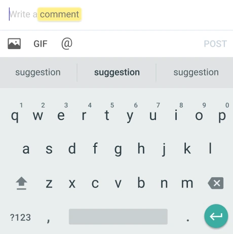
The LMInputText component is a customizable input field designed for React Native applications. It allows users to enter text, with props enabling various configurations such as placeholder text, input styling, and text change handling. The component is built to enhance user interaction by providing options like secure text entry for passwords and customizable icons for actions like clearing the input. Overall, LMInputText aims to deliver a flexible and user-friendly text input experience within the LikeMinds community platform.
GitHub File:

Props
Interaction Callbacks
onType: Callback to handle on type events trigerred by typing text on the text input.
Customisation Props
| Property | Type | Description | Required |
|---|---|---|---|
| inputText | string | This represents the text to be displayed on the text input. | ✔️ |
| onType | Function | This represents a callback function that is called when the text input's text changes. | ✔️ |
| partTypes | PartType[] | An array of part types that can be used to define the structure or format of the input text. | |
| inputRef | Ref<TextInput> | A reference to the text input component, allowing for direct manipulation or access to its methods. | |
| containerStyle | StyleProp<ViewStyle> | Custom styles for the container of the text input. | |
| inputTextStyle | TextStyle | This represents the style of the input text. | |
| placeholderText | string | This represents the text to be displayed before any text is entered. | |
| placeholderTextColor | string | This represents the color of the placeholder text. | |
| autoCapitalize | 'none' or 'sentences' or 'words' or 'characters' | This represents the auto capitalization behavior of the input text. | |
| keyboardType | 'default' or 'number-pad' or 'decimal-pad' or 'numeric' or | This represents the type of keyboard to be opened. | |
'email-address' or 'phone-pad' or 'url' or | |||
'ascii-capable' or 'numbers-and-punctuation' or | |||
'name-phone-pad' or 'twitter' or 'web-search' or | |||
'visible-password' | |||
| multilineField | boolean | This represents if the input text should be multi-lined or not. | |
| secureText | boolean | This represents if the text entered should be hidden or visible for sensitive text like passwords. | |
| rightIcon | LMButtonProps | This represents the icon on the text input. | |
| autoFocus | boolean | Checks if the text input should be focused or not. | |
| textValueStyle | TextStyle | Custom styles for the text value display. |
Usage Example
<LMInputText
  placeholderText={"placeholder..."}
  style={{
    height: 30,
  }}
  multilineField={true}
  inputRef={myRef}
  onType={handleInputChange}
  autoFocus={false}
  inputText={message}
  maxLength={100}
/>