Link Preview
Overview
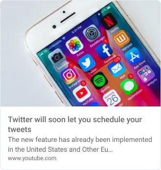
LMLinkPreview is a component used to display a preview of a link shared in a post. It fetches metadata from the provided URL, such as the title, description, and thumbnail image, and displays it in a styled card format. The preview typically includes an image, title, and a brief description, giving users a quick glimpse of the linked content.
GitHub File:

Styling Customisation
| Property | Type | Description |
|---|---|---|
onTap | Function | Function to execute when the link preview is tapped. |
showLinkUrl | boolean | Whether to show the URL of the link preview. |
linkPreviewBoxStyle | ViewStyle | Style for the container of the link preview. |
linkTitleStyle | TextStyle | Style for the link title text. |
linkDescriptionStyle | TextStyle | Style for the link description text. |
linkUrlStyle | TextStyle | Style for the link URL text. |
linkImageStyle | ImageStyle | Style for the link preview image. |
showDescription | boolean | Whether to show the description in the link preview. |
showImage | boolean | Whether to display the image in the link preview. |
showTitle | boolean | Whether to show the title in the link preview. |
showCancel | boolean | Whether to show a cancel button for the link preview. |
onCancel | Function | Function to execute when the cancel button is pressed. |
cancelButton | CancelButton | Object to customize the cancel button (see table below). |
CancelButton Object
| Property | Type | Description |
|---|---|---|
text | LMTextProps | Customization for the text in the cancel button. |
icon | LMIconProps | Customization for the icon in the cancel button. |
onTap | Function | Function triggered when the cancel button is tapped. |
placement | start or end | Position of the icon or text in the cancel button. |
buttonStyle | ViewStyle | Style for the cancel button container. |
isClickable | boolean | Determines if the cancel button is clickable. |
Usage Example
import {STYLES} from "@likeminds.community/feed-rn-core"

STYLES.setPostListStyles({
    media: {
        linkPreview: {
            showLinkUrl: true,
            linkPreviewBoxStyle: {
                backgroundColor: 'black',
                borderRadius: 10,
            },
            showImage: true
        }
    }
})