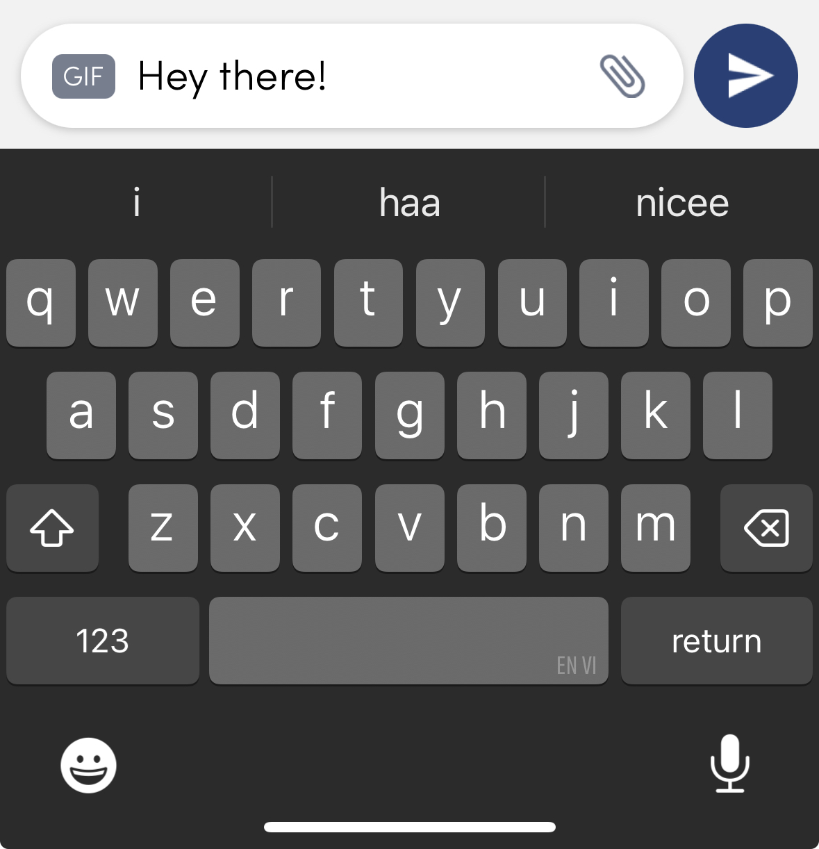
Chat TextInput
Overview
LMChatTextInput is a UI component specifically crafted to facilitate message input within a chat interface. It functions as an interactive input box, allowing users to seamlessly compose messages as part of their chat experience. Additionally, it supports features like tagging and media, enhancing user interaction by enabling users to mention others or share multimedia content within the chat.
GitHub File

Customisation/Props
The LMChatTextInput component requires certain props, some of which are mandatory, while others are optional. Here is a breakdown of the available props along with their types:
| Parameter | Type | Description | Optional |
|---|---|---|---|
| inputText | string | Represents the text to be displayed on the text input | |
| onType | (value: string) => void | Callback function called when the text input's text changes | |
| partTypes | PartType[] | Array of part types | ✔️ |
| inputRef | Ref<TextInput> | Reference to the text input component | ✔️ |
| containerStyle | StyleProp<ViewStyle> | Style for the container of the text input | ✔️ |
| inputTextStyle | TextStyle | Style for the input text | ✔️ |
| placeholderText | string | Text to be displayed before any text is entered | ✔️ |
| placeholderTextColor | string | Color of the placeholder text | ✔️ |
| autoCapitalize | "none" | "sentences" | "words" | "characters" | Auto capitalization behavior of the input text | ✔️ |
| keyboardType | "default" | "number-pad" | "decimal-pad" | Type of keyboard to be opened | ✔️ |
| plainTextStyle | StyleProp<TextStyle> | Style for plain text (not placeholder or input text) | ✔️ |
| multilineField | boolean | Indicates if the input text should be multi-lined or not | ✔️ |
| secureText | boolean | Indicates if the entered text should be hidden (e.g., for passwords) | ✔️ |
| disabled | boolean | Indicates if the text input is editable or not | ✔️ |
| autoFocus | boolean | Checks if the text input should be in focus by default | ✔️ |
Usage Example
<LMChatTextInput
  placeholderText={"placeholder..."}
  style={{
    height: 30,
  }}
  multilineField={true}
  inputRef={myRef}
  onType={handleInputChange}
  autoFocus={false}
  inputText={message}
  maxLength={100}
/>