LMFeedCarousel
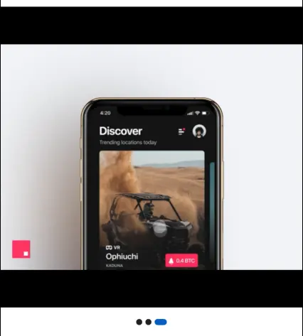
LMFeedCarousel is a widget that displays a carousel of media items (images or videos) within a feed post. It allows users to swipe through multiple media attachments associated with a post. The widget provides customization options for styling the carousel and handling media-related events.

The LMFeedCarousel widget is part of the likeminds_feed_flutter_ui package. It is designed to be used within an LMFeedPostWidget to display a carousel of media items associated with a post.
Properties
attachments(List<LMAttachmentViewData>) - Required
The list of media attachments to be displayed in the carousel. This is a required parameter.
postId(String) - Required
The unique identifier of the post associated with the carousel. This is a required parameter.
imageItem(LMFeedImage)
A custom image widget to be used for displaying image attachments in the carousel. This is an optional parameter.
videoItem(LMFeedVideo)
A custom video widget to be used for displaying video attachments in the carousel. This is an optional parameter.
imageBuilder(Widget Function(LMFeedImage))
A builder function that takes an LMFeedImage widget and returns a custom widget for displaying image attachments in the carousel. This is an optional parameter.
videoBuilder(Widget Function(LMFeedVideo))
A builder function that takes an LMFeedVideo widget and returns a custom widget for displaying video attachments in the carousel. This is an optional parameter.
videoStyle(LMFeedPostVideoStyle)
The style configuration for video attachments in the carousel. This is an optional parameter.
imageStyle(LMFeedPostImageStyle)
The style configuration for image attachments in the carousel. This is an optional parameter.
style(LMFeedPostCarouselStyle)
The style configuration for the carousel itself. It allows customization of the carousel's appearance and behavior. This is an optional parameter.
onError(Function(String, StackTrace))
A callback function that is invoked when an error occurs while loading or displaying media attachments in the carousel. It takes the error message and stack trace as parameters. This is an optional parameter.
onMediaTap(VoidCallback)
A callback function that is invoked when a media item in the carousel is tapped. This is an optional parameter.
Styling
The LMFeedPostCarouselStyle class allows you to customize the appearance and behavior of the LMFeedCarousel widget.
Customization variables
| Property | Type | Description | Required | Default |
|---|---|---|---|---|
carouselOptions | CarouselOptions | The options for configuring the carousel behavior. | ||
activeIndicatorColor | Color | The color of the active indicator dot. | ||
inActiveIndicatorColor | Color | The color of the inactive indicator dots. | ||
indicatorHeight | double | The height of the indicator dots. | ||
indicatorWidth | double | The width of the indicator dots. | ||
indicatorMargin | EdgeInsets | The margin around the indicator dots. | ||
indicatorPadding | EdgeInsets | The padding within the indicator dots. | ||
indicatorBorderRadius | BorderRadius | The border radius of the indicator dots. | ||
showIndicator | bool | Whether to show the indicator dots. | ||
carouselHeight | double | The height of the carousel container. | ||
carouselWidth | double | The width of the carousel container. | ||
carouselBorderRadius | BorderRadius | The border radius of the carousel container. | ||
carouselBorder | Border | The border of the carousel container. | ||
carouselMargin | EdgeInsets | The margin around the carousel container. | ||
carouselPadding | EdgeInsets | The padding within the carousel container. | ||
carouselShadow | List\<BoxShadow> | The box shadow for the carousel container. |
You can create an instance of LMFeedPostCarouselStyle and pass it to the LMFeedCarousel widget to customize its appearance and behavior.
Usage Example
LMFeedCarousel(
  attachments: [
    LMAttachmentViewData(
      attachmentType: 1,
      attachmentMeta: LMAttachmentMeta(
        url: 'your-attachment-url',
      ),
    ),
    LMAttachmentViewData(
      attachmentType: 2,
      attachmentMeta: LMAttachmentMeta(
        url: 'your-attachment-url',
      ),
    ),
    LMAttachmentViewData(
      attachmentType: 1,
      attachmentMeta: LMAttachmentMeta(
        url: 'your-attachment-url',
      ),
    ),
  ],
  postId: 'your-post-id',
  imageStyle: LMFeedPostImageStyle(
    // Customize image style
  ),
  videoStyle: LMFeedPostVideoStyle(
    // Customize video style
  ),
  style: LMFeedPostCarouselStyle(
    carouselOptions: CarouselOptions(
      autoPlay: true,
      enableInfiniteScroll: false,
      viewportFraction: 1.0,
    ),
    activeIndicatorColor: Colors.blue,
    inActiveIndicatorColor: Colors.grey,
    indicatorHeight: 10,
    indicatorWidth: 10,
    showIndicator: true,
    carouselHeight: 300,
    carouselBorderRadius: BorderRadius.circular(8),
    carouselMargin: EdgeInsets.symmetric(vertical: 16),
    carouselPadding: EdgeInsets.all(8),
    carouselShadow: [
      BoxShadow(
        color: Colors.black.withOpacity(0.2),
        blurRadius: 4,
        offset: Offset(0, 2),
      ),
    ],
  ),
  onError: (error, stackTrace) {
    // Handle media loading error
    print('Error loading media: $error');
  },
  onMediaTap: () {
    // Handle media tap
    print('Media item tapped');
  },
)
In this example, an LMFeedCarousel widget is created with a list of attachments containing both image and video attachments. The postId is provided to identify the associated post. The imageStyle and videoStyle properties are used to customize the appearance of image and video attachments within the carousel. The style property is used to customize the appearance and behavior of the carousel itself, specifying options such as auto-play, indicator colors, indicator size, carousel height, border radius, margin, padding, and box shadow. The onError callback is provided to handle any errors that occur while loading media attachments, and the onMediaTap callback is invoked when a media item in the carousel is tapped.