LMFeedAppBar
LMFeedAppBar is a highly customizable widget designed for displaying app bars within the Flutter UI library. It supports various configurations, including leading and trailing widgets, titles, back button callbacks, and styling options.
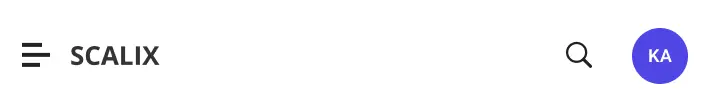
The LMFeedAppBar widget provides a flexible app bar implementation that can be tailored to meet the specific needs of your application. It allows you to customize the appearance and behavior of the app bar, including the background color, border, shadow, padding, and more.
Properties
leading(Widget)
An optional widget to be displayed at the leading edge of the app bar, typically used for displaying a back button or other navigation controls.
trailing(List<Widget>)
An optional list of widgets to be displayed at the trailing edge of the app bar, typically used for displaying action buttons or other controls.
title(Widget)
An optional widget to be displayed as the title of the app bar.
backButtonCallback(Function)
An optional callback function that is invoked when the back button is pressed. If not provided, the default behavior is to navigate back in the app's navigation stack.
style(LMFeedAppBarStyle)
An optional style class that allows customization of the app bar's appearance, such as background color, border, shadow, padding, and more.
Styling
The LMFeedAppBarStyle class provides a way to define the visual style of the app bar. It includes properties for background color, height, width, border, padding, margin, shadow, and title alignment.
Customization variables
| Property | Type | Description | Required | Default |
|---|---|---|---|---|
backgroundColor | Color | Background color of the app bar | ||
height | double | Height of the app bar | ||
width | double | Width of the app bar | ||
border | Border | Border of the app bar | ||
padding | EdgeInsets | Padding of the app bar | EdgeInsets.symmetric(horizontal: 12.0, vertical: 4.0) | |
margin | EdgeInsets | Margin of the app bar | EdgeInsets.zero | |
shadow | List\<BoxShadow> | Shadow of the app bar | ||
centerTitle | bool | Whether to center the title or not | false |
Usage Example
LMFeedAppBar(
  leading: LMFeedButton(
    style: LMFeedButtonStyle(
      icon: LMFeedIcon(
        type: LMFeedIconType.icon,
        icon: Icons.menu,
      ),
    ),
    onTap: () {
      // Handle menu button tap
    },
  ),
  title: LMFeedText(
    text: 'My App',
    style: LMFeedTextStyle(
      textStyle: TextStyle(
        fontWeight: FontWeight.bold,
        fontSize: 18,
      ),
    ),
  ),
  trailing: [
    LMFeedButton(
      style: LMFeedButtonStyle(
        icon: LMFeedIcon(
          type: LMFeedIconType.icon,
          icon: Icons.search,
        ),
      ),
      onTap: () {
        // Handle search button tap
      },
    ),
  ],
  style: LMFeedAppBarStyle(
    backgroundColor: Colors.blue,
    height: 56,
    padding: const EdgeInsets.symmetric(horizontal: 16),
    shadow: [
      BoxShadow(
        color: Colors.grey.withOpacity(0.5),
        spreadRadius: 2,
        blurRadius: 4,
        offset: const Offset(0, 2),
      ),
    ],
  ),
),
This example creates an LMFeedAppBar with a leading menu button, a title "My App", and a trailing search button. The app bar is styled with a blue background color, a height of 56 pixels, horizontal padding of 16 pixels, and a drop shadow. When the menu button is tapped, it triggers the onTap callback function, allowing you to handle the menu action.