LMFeedTopicBar
LMFeedTopicBar is a widget that represents a topic bar in a feed. It displays the selected topics and provides an option to open a topic selector. The widget can be customized by passing in the required parameters and styling options.
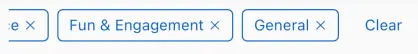
The LMFeedTopicBar widget is part of the likeminds_feed_flutter_ui package. It is designed to be used within a feed to display the currently selected topics and allow users to modify the selection.
Properties
selectedTopics(List<LMTopicViewData>) - Required
A list of selected topics to be displayed in the topic bar. This is a required parameter.
openTopicSelector(VoidCallback) - Required
A callback function that is invoked when the topic bar is tapped to open the topic selector. This is a required parameter.
removeTopicFromSelection(Function(LMTopicViewData))
A callback function that is invoked when a topic is removed from the selection. It takes the LMTopicViewData of the removed topic as a parameter. This is an optional parameter.
style(LMFeedTopicBarStyle)
The style configuration for the topic bar. It allows customization of the topic bar's appearance and behavior. This is an optional parameter.
Styling
The LMFeedTopicBarStyle class allows you to customize the appearance and behavior of the LMFeedTopicBar widget.
Customization Variables
| Property | Type | Description | Required | Default |
|---|---|---|---|---|
backgroundColor | Color | The background color of the topic bar. | Theme container color | |
padding | EdgeInsets | The padding of the topic bar. | EdgeInsets.symmetric(horizontal: 20.0, vertical: 12.0) | |
margin | EdgeInsets | The margin around the topic bar. | ||
boxShadow | List\<BoxShadow> | The box shadow for the topic bar. | ||
border | Border | The border of the topic bar. | ||
borderRadius | BorderRadius | The border radius of the topic bar. | ||
height | double | The height of the topic bar. | ||
width | double | The width of the topic bar. | ||
topicChipText | String | The text to be displayed when no topics are selected. | "All Topic" | |
topicChipStyle | LMFeedTopicChipStyle | The style configuration for the topic chips within the topic bar. |
You can create an instance of LMFeedTopicBarStyle and pass it to the LMFeedTopicBar widget to customize its appearance and behavior.
Usage Example
LMFeedTopicBar(
  selectedTopics: [
    LMTopicViewData(id: 'topic1', name: 'Technology', isEnabled: true),
    LMTopicViewData(id: 'topic2', name: 'Sports', isEnabled: true),
  ],
  openTopicSelector: () {
    // Open topic selector
    print('Opening topic selector');
  },
  removeTopicFromSelection: (topic) {
    // Remove topic from selection
    print('Removing topic: ${topic.name}');
  },
  style: LMFeedTopicBarStyle(
    backgroundColor: Colors.white,
    padding: EdgeInsets.symmetric(horizontal: 16, vertical: 8),
    margin: EdgeInsets.symmetric(vertical: 8),
    boxShadow: [
      BoxShadow(
        color: Colors.black.withOpacity(0.1),
        blurRadius: 4,
        offset: Offset(0, 2),
      ),
    ],
    border: Border.all(color: Colors.grey),
    borderRadius: BorderRadius.circular(8),
    height: 48,
    width: double.infinity,
    topicChipText: 'Select Topics',
    topicChipStyle: LMFeedTopicChipStyle(
      backgroundColor: Colors.blue,
      textStyle: TextStyle(color: Colors.white),
    ),
  ),
)
In this example, an LMFeedTopicBar widget is created with a list of selected topics specified using LMTopicViewData. The openTopicSelector callback is provided to handle the action when the topic bar is tapped to open the topic selector. The removeTopicFromSelection callback is optional and can be used to handle the removal of a topic from the selection.
The appearance and behavior of the topic bar are customized using the LMFeedTopicBarStyle class. Various properties such as backgroundColor, padding, margin, boxShadow, border, borderRadius, height, width, topicChipText, and topicChipStyle are used to define the styling of the topic bar and the topic chips within it.
The topicChipText property specifies the text to be displayed when no topics are selected, and the topicChipStyle property allows customization of the topic chips' appearance using the LMFeedTopicChipStyle class.